Industry
Client
A Vibrant Beauty Brand Experience
Overview
Made by Mitchell is a bold, trendsetting cosmetics brand known for vibrant products and a loyal following. The goal was to revamp their e-commerce platform to better reflect the brand’s energy, improve the shopping experience, and drive online sales. This project required balancing a visually striking aesthetic with seamless functionality to create a platform as bold as the products it represents.
Project Goals
Striking Visual Appeal: Design a site that mirrors the brand’s vibrant personality while maintaining a clean, user-friendly interface.
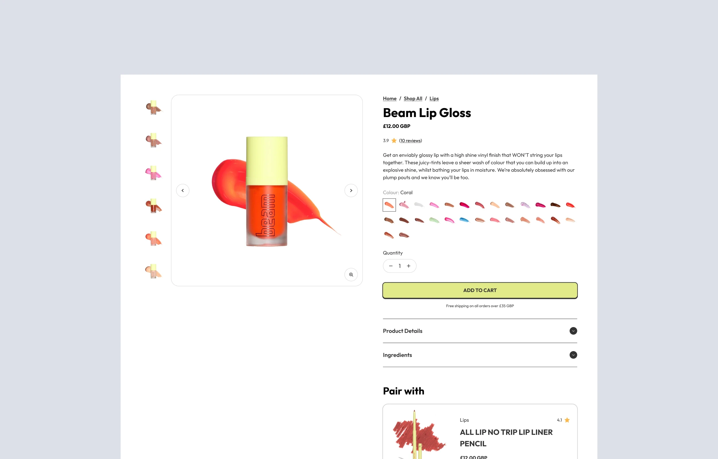
Optimised User Journey: Create a smooth shopping flow from browsing to checkout to reduce cart abandonment rates.
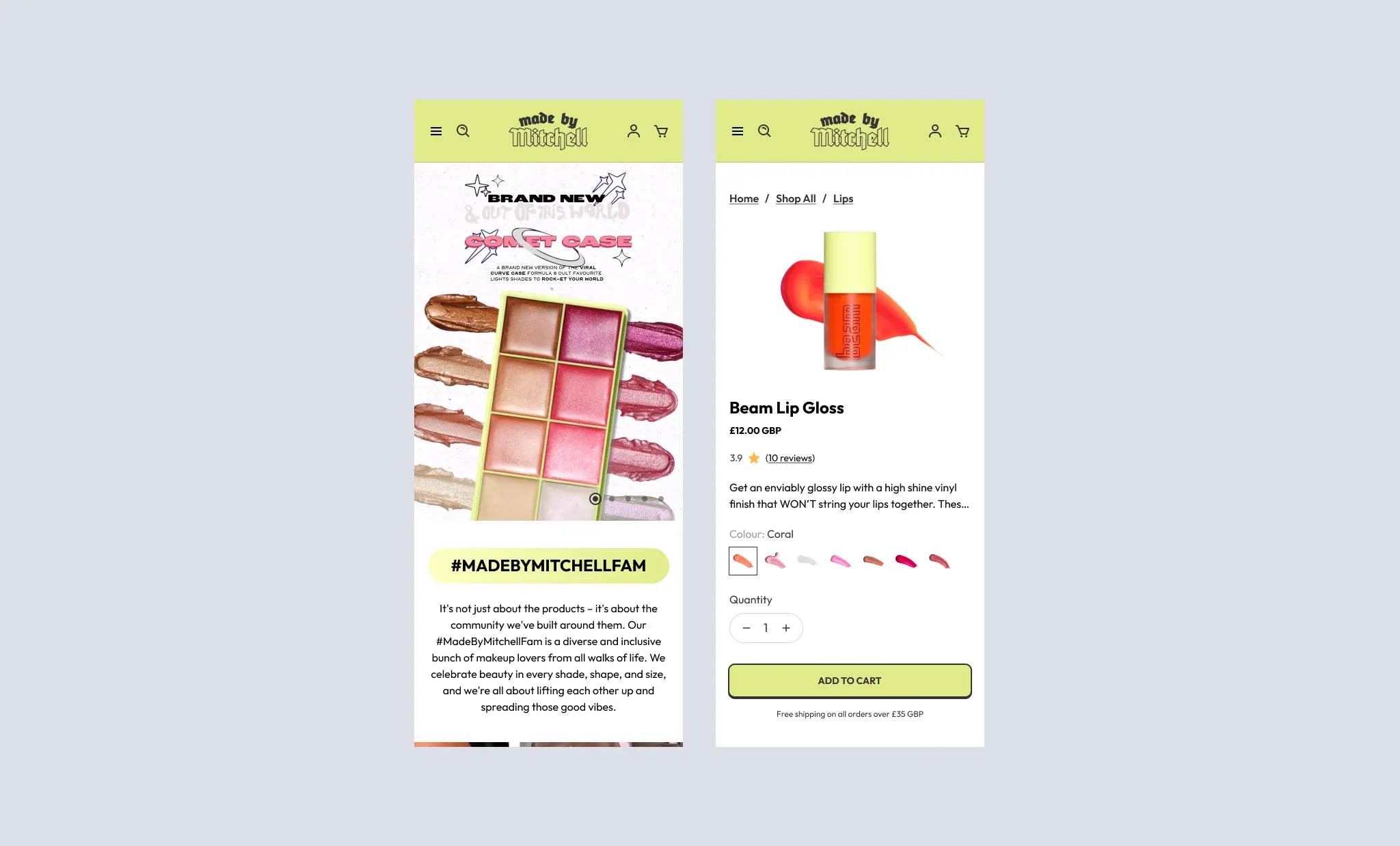
Mobile-First Design: Ensure flawless performance on mobile devices to cater to the brand’s youthful, on-the-go audience.
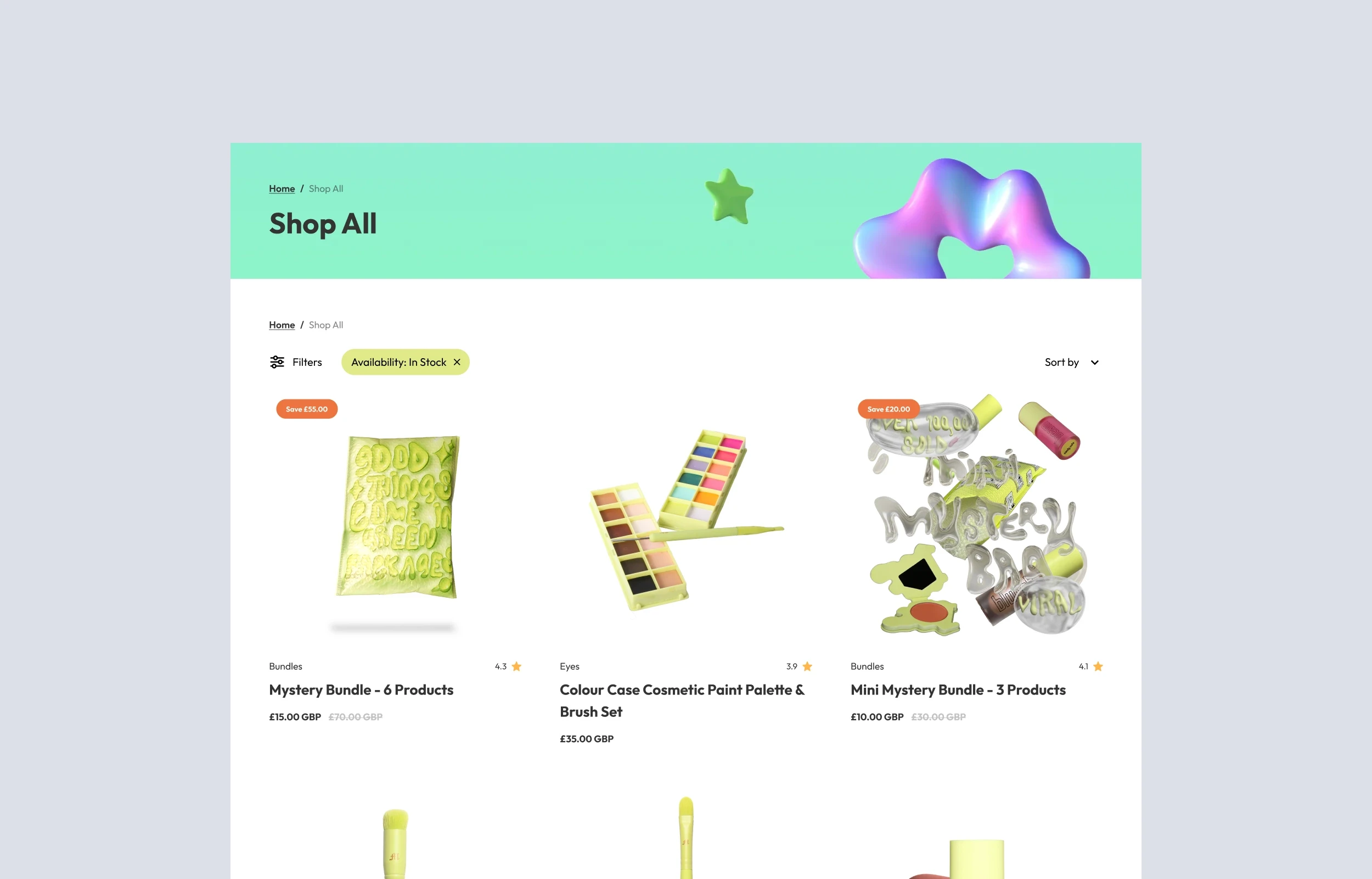
Enhanced Product Discovery: Highlight products and collections with intuitive categorisation and search functionalities.
Discovery & Research
Audience Analysis: Analysed the target audience—beauty enthusiasts seeking bold, high-quality cosmetics—to understand their preferences and online shopping behaviours.
Competitive Benchmarking: Studied leading cosmetics e-commerce platforms to identify opportunities for differentiation, focusing on visual appeal and usability.
Design & Prototyping
Wireframes: Developed wireframes focusing on a clean layout that balances high-impact visuals with easy navigation.
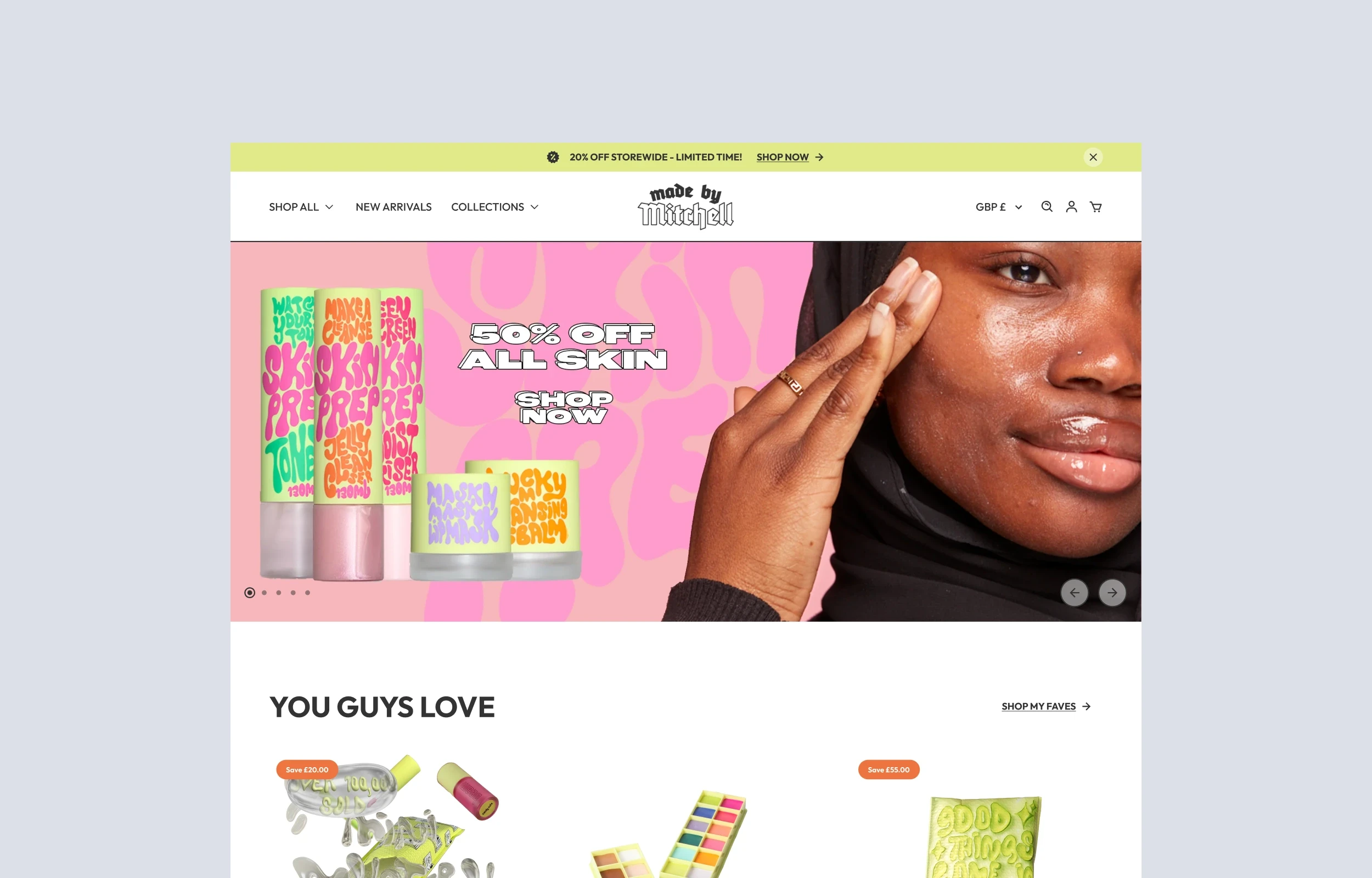
High-Fidelity Designs: Created mockups showcasing vibrant imagery, bold typography, and dynamic product showcases to align with the brand’s playful yet professional identity.
Interactive Prototypes: Built clickable prototypes to test the user flow and gather feedback before moving into development.
Key Features
Dynamic Visual Design: Vibrant banners, high-quality product imagery, and bold typography reflect the brand’s unique personality.
Smart Product Filtering: Added advanced filters (e.g., colour, finish, price range) to help users find products that match their preferences.
Optimised Mobile Experience: Designed for mobile-first users with touch-friendly interactions, streamlined navigation, and fast-loading pages.
Social Integration: Embedded Instagram feeds and user-generated content to showcase the brand’s community and drive social proof.
Results
Improved Conversion Rates: The optimised shopping journey led to a measurable increase in completed purchases, particularly on mobile devices.
Enhanced User Engagement: Dynamic design elements and improved navigation encouraged users to spend more time browsing products and collections.
Positive Feedback: The brand received enthusiastic responses from both new and loyal customers who found the updated site easier to use and visually exciting.
Reflections & Next Steps
This project was an opportunity to blend bold design with practical e-commerce functionality. The new Made by Mitchell website embodies the brand’s vibrant identity while meeting the needs of its digitally savvy audience. Moving forward, features like a loyalty program could further elevate the shopping experience.


