Industry
Client
GAVS Group Website Resdesign
Overview
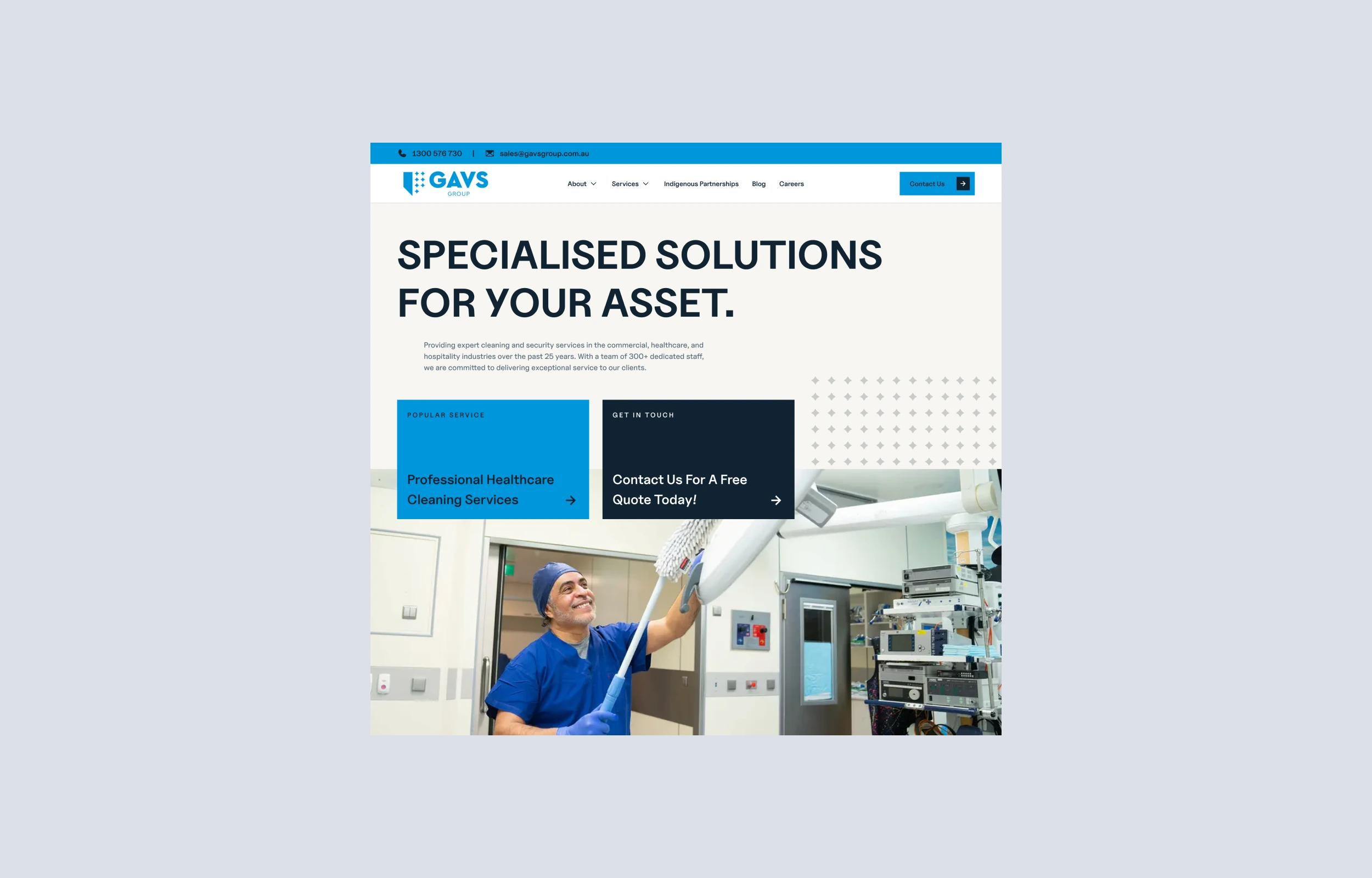
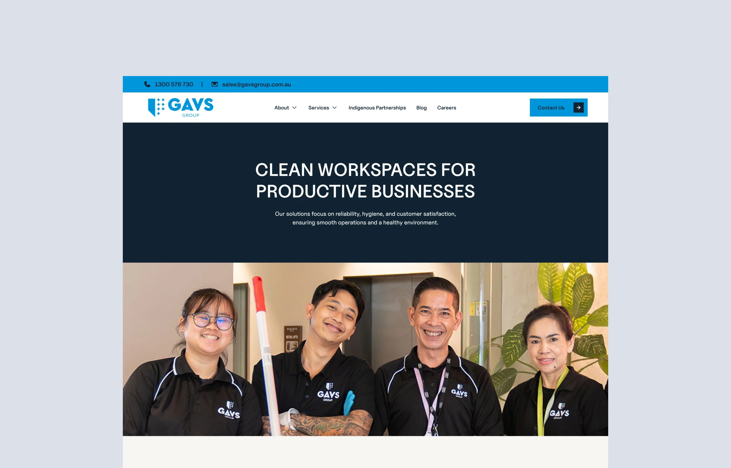
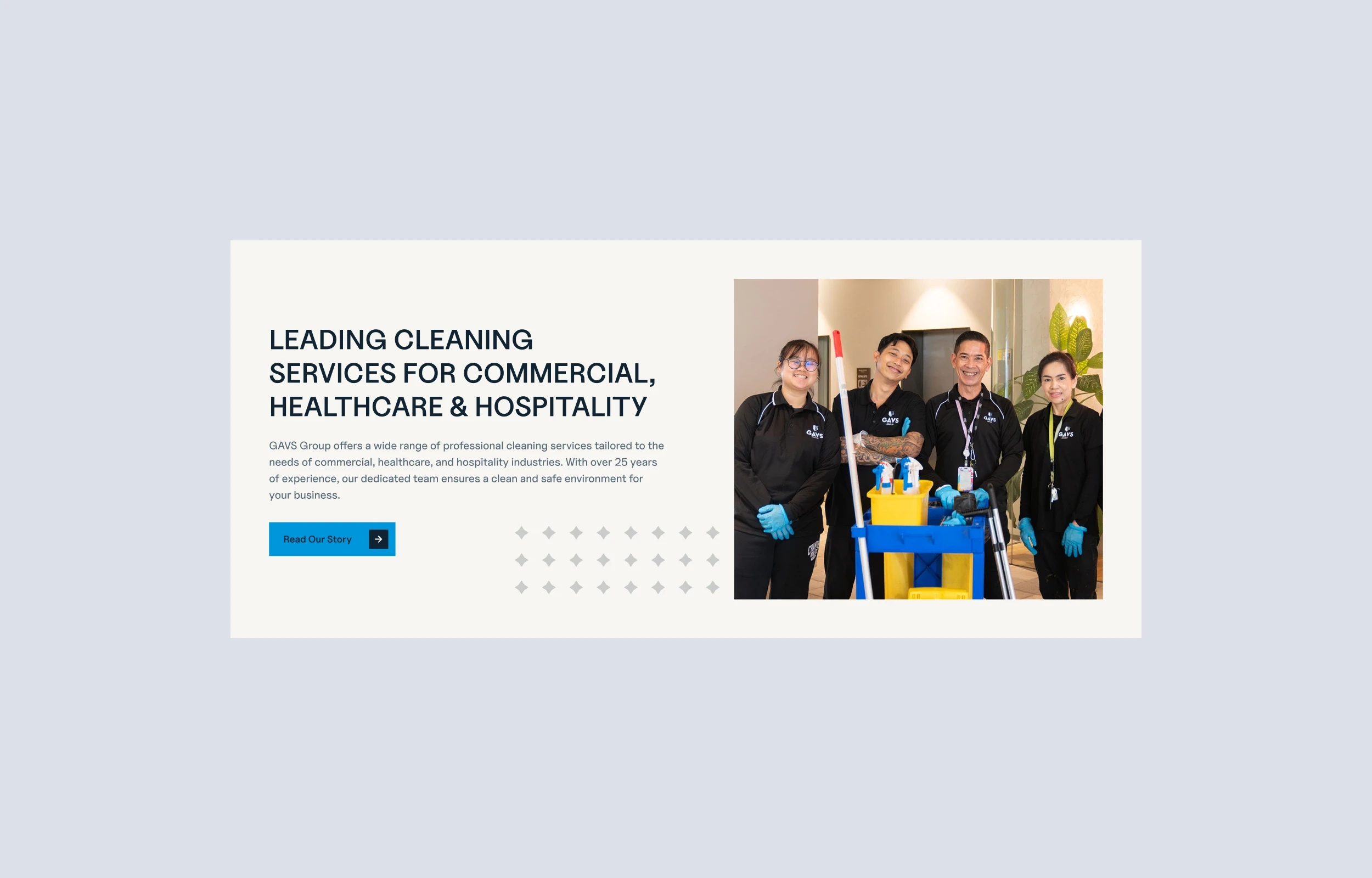
GAVS Group needed a brochure site that could serve as a powerful, visually engaging platform for showcasing their skills in cleaning, and asset management across a range of industries. The goal was to develop a sleek, client-focused site that positions GAVS Group as an expert in their sector, helping them attract potential clients while reflecting their corporate style.
Project Goals
Memorable Branding: Position GAVS Group as a unique and innovative designer by crafting a distinctive look and feel that reflects their personal brand.
User-Centric Layout: Develop a straightforward, intuitive user flow, emphasising clarity in navigation and ease of access to essential information.
Performance Optimisation: Prioritise fast load times and mobile responsiveness to ensure a smooth experience across all devices.
Discovery & Research
Key Findings: Potential clients are often looking for immediate information on expertise and services. First impressions are crucial, and the design needed to stand out yet remain highly functional and accessible.
Competitive Analysis: Conducted research on similar organisations in the space to identify opportunities for differentiation. Analysed layout, interaction, and navigation strategies from leading competitors, aiming to strike a balance between aesthetic appeal and usability.
Design & Prototyping
Wireframing: Mapped out an initial structure, focusing on a clean, minimalistic layout with a clear hierarchy. Key sections (About, Services, Contact) were prioritised to guide user flow.
Mood Board & Branding: Collaborated on creating a visual mood board that reflected the GAVS Group style, combining bold typography, a neutral colour palette, and subtle micro-animations.
High-Fidelity Prototyping: Used Figma to develop a fully interactive prototype, enabling client feedback on brand assets, layout, and functionality before moving to development.
Development in Framer
Low-Code Efficiency: Leveraged Framer’s low-code capabilities to quickly implement the design, using components that would ensure a smooth user experience without sacrificing creativity.
Responsive Design: Customised elements for optimal viewing on mobile and desktop, using responsive layouts and media queries to enhance usability on all devices.
Performance Optimisation: Focused on reducing load times by optimising images and code, ensuring the site’s technical performance matched its aesthetic.
On-Page SEO: Implemented best SEO practices to help with the overall score of the website when competing with others in the industry in search.
User Testing & Iteration
Feedback Rounds: Conducted usability testing with a small group of stakeholders, gathering insights on navigation flow, visual appeal, and accessibility.
Iterative Adjustments: Made refinements based on feedback, including improving text readability, enhancing interactive elements, and simplifying mobile navigation.
Key Features
Intuitive Navigation: Implemented a clean, sticky header with easy access to all primary sections, ensuring a seamless browsing experience.
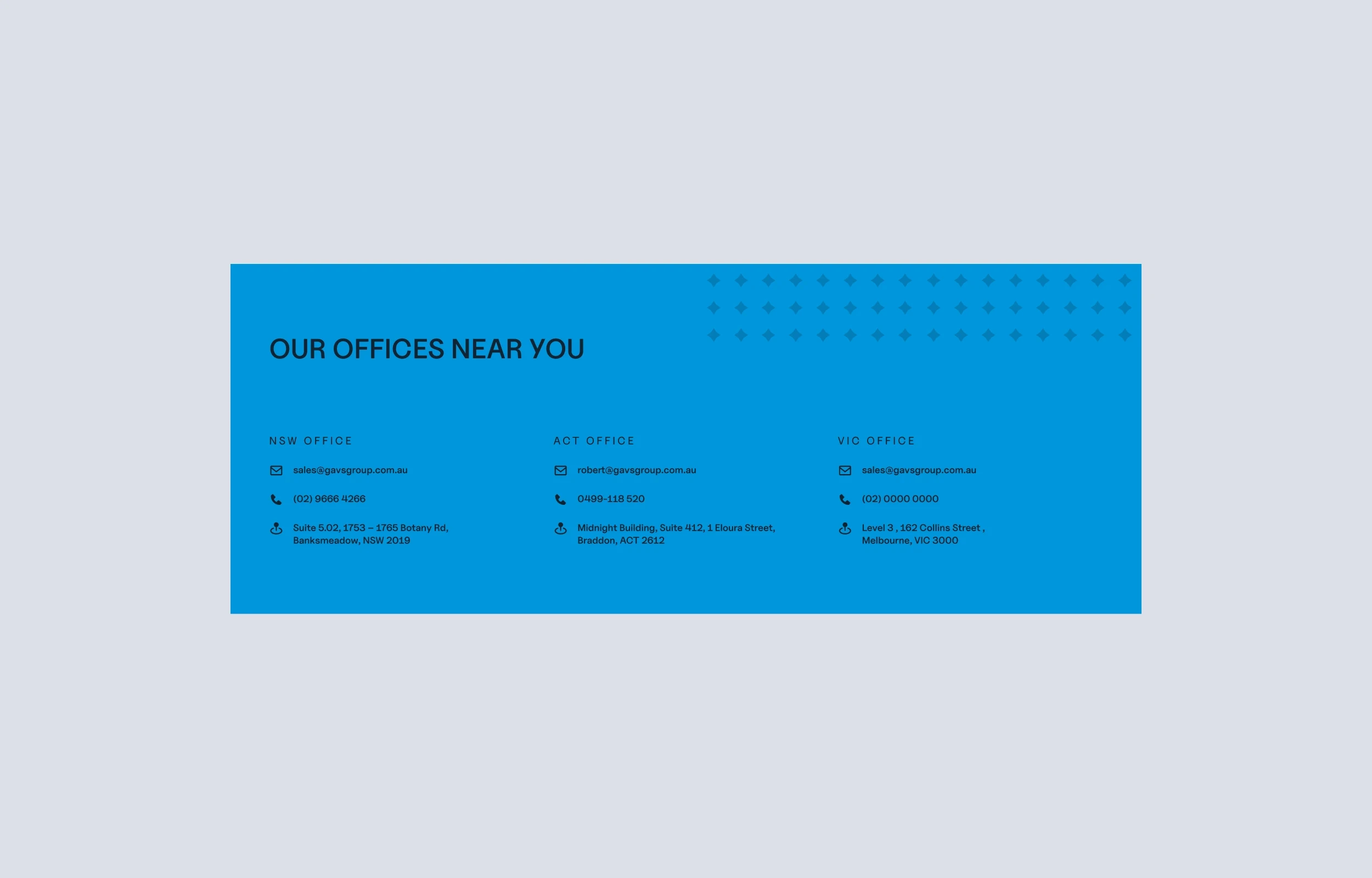
Contact Form Integration: Used Framer’s customisable form component to streamline client inquiries and simplify outreach.
Results
Increased Engagement: The revamped site saw a noticeable improvement in visitor retention, with users spending more time on the site overall.
Improved Client Inquiries: GAVS Group reported a smoother onboarding process, with more clients using the contact form for inquiries directly.
Positive User Feedback: Post-launch feedback highlighted the site’s visual appeal, ease of navigation, and mobile-friendly design.
Reflections & Next Steps
This project showcased GAVS' ability to balance aesthetic creativity with a strategic focus on client needs, creating a streamlined, engaging, and responsive site that has elevated their personal brand. Moving forward, GAVS Group plan to expand with a case studies section and refine the site's interactive elements to keep the site fresh and engaging for prospective clients.


