Edberts House
Edberts House, a community wellbeing organisation in the North East, relied on a paper-based tool called HAY (How Are You) to support person-centred conversations between Social Prescribing Link Workers and the people they support.
I led the end-to-end design of a digital version of HAY - from early workflow research through to UI design and developer handoff - turning a manual, paper process into a secure digital platform used across link workers, administrators, and patients.

The Problem
HAY worked well as a paper tool because it was simple and personal - but that simplicity came at a cost. Every conversation had to be manually logged and processed afterwards, which meant:
No consistent, structured way to track a person's progress over time.
Data that was hard to aggregate, limiting the organisation's ability to evidence outcomes for funders.
Extra administrative work piled onto already-stretched link workers.
No real-time visibility into how people were progressing across their wellbeing journey.
The brief was to digitise HAY without losing what made it work: a tool built around trust and conversation, not data entry. It also had to handle sensitive health and wellbeing information, so it needed to be secure and GDPR-compliant by design, and it couldn't add friction to a workflow that was already under pressure.
The Process
Understanding the paper process first
Before designing anything, I worked directly with link workers and administrators to map how HAY was actually used day to day - where the paper process created friction, where it worked well, and what practitioners would lose if a digital version got it wrong. This shaped a key design principle I carried through the whole project: the digital tool needed to feel like the paper process, not replace it with something unfamiliar.

Structuring for three very different users
One of the harder problems was that HAY needed to serve three distinct groups with different needs and permissions:
Patients - who needed to feel comfortable engaging directly with the tool during a conversation, often for the first time.
Link workers - who needed to manage individual journeys without the tool getting in the way of the conversation itself.
Administrators - who needed oversight across caseloads without access to information beyond their remit.
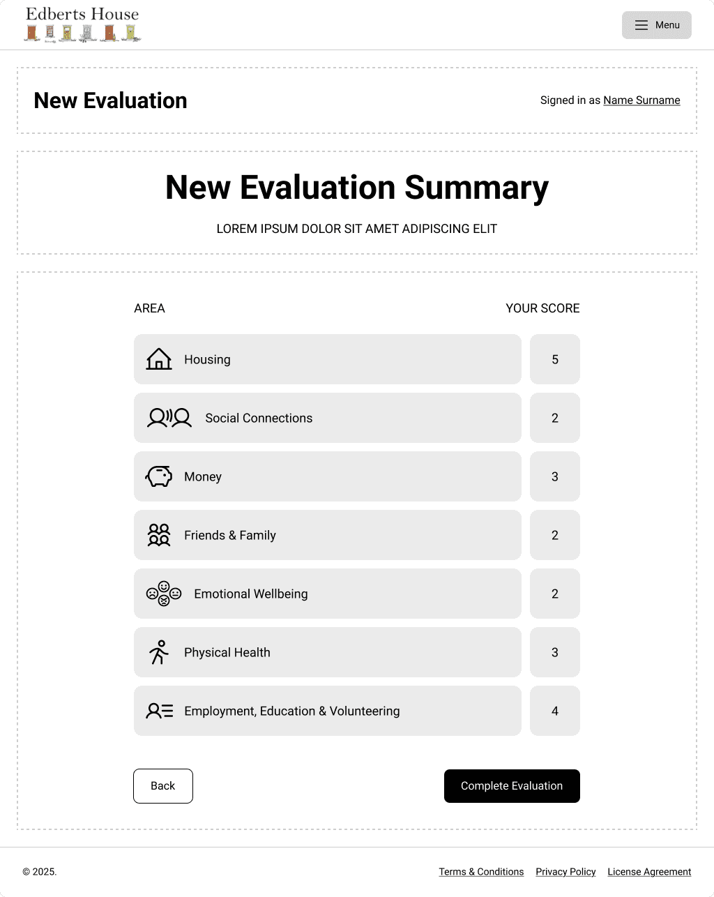
I designed the information architecture and access model around these three roles, defining what each could see and do, and mapped the UX flows for each journey before moving into wireframes.
Designing for a sensitive, in-person moment
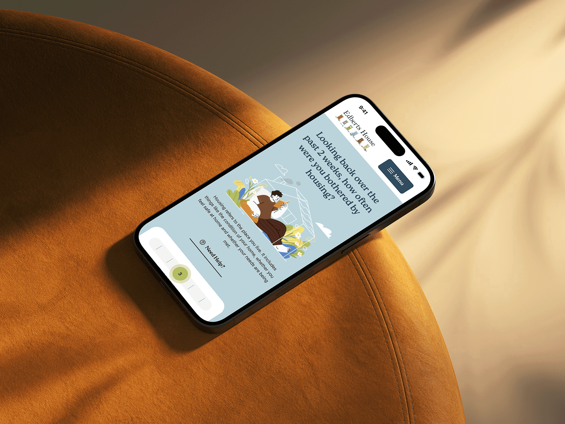
Because the tool would often be used during a conversation - with the patient present and participating - the interface had to stay out of the way. I focused the UI design on a calm, plain-language interface that supported the conversation rather than dominating it, so the interaction still felt human rather than transactional.


Working with developers through build
I stayed involved through the Laravel build, working with developers to make sure the access model, flows, and interface held up as real functionality - including how permissions were enforced and how the interface behaved for each user type.
Highlights
Human-centred interaction design
Designed the interface so patients could engage directly with the tool alongside their link worker during live sessions - reinforcing a sense of ownership over their own wellbeing journey, rather than feeling like they were being processed.
Multi-layered access model
Defined and designed a permissions structure spanning patients, link workers, and administrators, reducing the risk of errors and ensuring each user only saw what was relevant to their role.

Continuity with the trusted paper process
Grounded every design decision in research with the people who used the paper tool daily, ensuring the digital experience felt supportive and familiar rather than disruptive during rollout.
Scalable foundation for future partners
Designed the platform's structure and flows to be adaptable, supporting its later rollout to pilot partners beyond Edberts House.
Outcome
The digital HAY tool reduced the administrative burden on link workers and gave Edberts House consistent, structured data on people's wellbeing over time for the first time - supporting both better conversations and a stronger evidence base for funding. Since its initial launch, the platform has been introduced to pilot partners across the North East, testing how the same approach can support person-centred care in other community settings.