Cheshire & Warrington
Cheshire and Warrington Combined Authority needed a new website to coincide with the launch of a new organisational brand, ahead of a fixed, public-facing deadline: their inaugural board meeting.
As lead designer, I was responsible for taking the project from research through to a fully designed, built, and QA'd site - translating a brand-new visual identity into a usable digital platform for residents, businesses, and partner organisations, under significant time pressure.

The Problem
The organisation was launching a new public identity and needed a website that could credibly represent it from day one. That meant solving three problems at once:
Hard external deadline
The inaugural board meeting that left no room for a conventional, phased design timeline and only 5 weeks from initiation to completion.
A mixed audience
Residents, local businesses, and government/partner stakeholders - all needing to find relevant information (transport policy, investment plans, governance documents) through the same site.
Brand identity
That had to be interpreted into a working UI system after its completion, 3 weeks into the website development timeline.
My Process
Research & stakeholder alignment
I ran stakeholder interviews early to understand what different audiences actually needed from the site, and to get clarity on the volume and type of content (reports, policy documents, governance material) it would need to hold - both at launch and as the organisation matured.
Structuring the content
With the deadline fixed, I prioritised getting information architecture right early, since restructuring later wasn't going to be possible. I mapped out a structure that let residents, businesses, and partner organisations reach relevant content without competing for the same navigation paths.
Wireframes & UX flows
I moved from structure into wireframes and flows, testing how key journeys (finding transport plans, understanding investment priorities, locating governance documents) would work in practice before any visual design was applied.
Translating the brand into UI
The organisation's new brand identity was being finalised in parallel with the build. I worked to interpret that identity into a coherent UI system - typography, colour, components - that felt authoritative and consistent, rather than skinning the brand onto a generic layout.
CMS & content modelling
Because the site needed to grow well beyond launch, I designed the CMS content model with future flexibility in mind rather than just what was needed on day one - anticipating additional content types, sections, and governance material without requiring a rebuild.
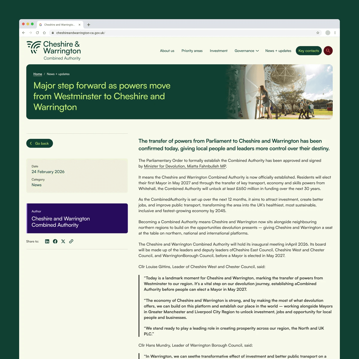

Dev collaboration & QA
I worked closely with developers through build, and ran QA across the finished site to catch issues before the launch deadline.
Highlights
Deadline-driven prioritisation
Faced with a fixed external deadline, I front-loaded the highest-risk decisions - information architecture and content modelling - early in the process, since these were the hardest to change later and the most damaging to get wrong.
Audience-first information architecture
Rather than a single generic structure, I designed navigation and content pathways around three distinct audiences (residents, businesses, partner organisations), so each could reach relevant information without wading through content meant for someone else.
Future-proofed CMS structure
I designed the content model to anticipate growth - new document types, sections, and governance content - so the platform could scale without a structural rebuild.
Brand-to-UI translation
I took a newly developed brand identity and turned it into a working design system, making decisions on how abstract brand elements (colour, tone, typography) should function as real interface components.
Outcome
The site launched on schedule ahead of the organisation's inaugural board meeting, giving the newly formed body a credible public presence and a functioning platform for residents, businesses, and partners from day one.